

Click for FREE Access To The 14 Day Blog Income Challenge!
Your blog is a direct reflection of who you are, or at least the “you” that you put out to the world through your messages. You want your blog to reflect not only the sentiment of your messages, but conveyed with a look and feel that reinforces your brand.
If you have an ugly blog, people aren’t going to stick around to get to know it – even if its “so amazing” on the inside, no one will take the time to look that far.
You could be the Shakespeare of your niche, artfully weaving together words within your posts that are like timeless poetry. But if people arrive and your site looks like this:
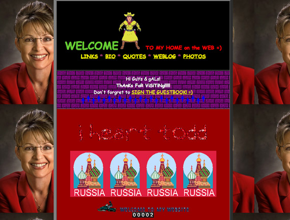
No one will ever know how amazing your writing is, because they’ll be backing out of there faster than you can say “lipstick on a pig”.
Now obviously thats a drastic example, but the look and cohesiveness of your site speaks a lot.
Studies have shown, you have about 2-3 seconds to win over your reader – if you do, they’ll stay and look around. If you don’t, they’ll leave and be gone forever.
So here’s a test for you to try on your own website…
…its called a Squint Test.
Pull up your website, and then step back about 5 feet, and squint your eyes to sort of blur out the small text and irrelevant details.
Where do you find your eyes focusing?
- Is it on something relevant and important to your site – an eyecatching logo or an important call to action?
- Or is it focusing on a flurry of 12 banner ads you have plastered across the top?
- Are you focusing on an out of place graphic, or background image that is distracting?
- Do you see nothing but blurry text?
- Do you see graphics that have nothing to do with what your initial perception of the site was supposed to be about?
This is a great litmus test for what your readers might be experiencing when they arrive at your site.
And it might shed some light into why people aren’t sticking around.
Graphics play an important role in the look of your site, and you want to make sure your graphics are well matched to your brand (coloring and styles), and that they are pleasing to the eye.
Ugly or poorly implemented graphics on your site can be as big of a turn off, as a blog post filled with typos or grammatical errors, or a post filled with offensive commentary.
“Content is King” refers to more than just your words, it speaks to the overall look and feel of your site. AND, how well that look meshes with people’s expectations.
So here’s a practical example.
If you were explaining your blog to a friend and could only use, 3-4 phrases or less, what would those words be?
If I was explaining Blog Genesis to a friend, I might say something like:
The purpose of this site is to offer:
- training on how to create a blog
- tools for increasing productivity when it comes to blogging
- tweaks and tips on using wordpress
- strategies for growing blogs into profitable businesses.
Now here is the critical part…
If I was to poll my audience – both people who were regular readers and familiar with my site, as well as those who might land on Blog Genesis for the first time, knowing nothing about it beforehand…
would they describe my website with similar keywords or focus phrases?
Based upon the 4 core areas of focus that I defined above, what if someone arrived at my blog and saw a logo that looked like this:

Do you think the branding within that logo supports or totally detracts from my 4 core focus areas I mentioned above?
Its totally ridiculous, right?
Which means it is detracting from my brand, and HURTING my site.
(And yes, I spent 10 minutes creating that logo, just for this example, I LOVE me some picmonkey!)
Nothing about that logo speaks to anything about my 4 core focus points.
Its super curly and scrolly which gives it more of an artsy/victorian type feel, there are hearts in the wording which might be ok for a blog that is super feminine or about kids, but certainly not for someone blogging about business.
And the tagline… making “what” awesome? What does that even mean?
(I tried to come up with the most ambiguous, random, off the wall tagline, to show an extreme example of branding gone totally wrong).
This logo is so off base from the topic of the blog – it is ridiculous. Now obviously, the vast majority of sites out there aren’t missing the mark quite this badly, but its something to consider.
My point is, the graphics and navigation on your site have to not only be eye catching and pleasing, but they also have to be relevant to your brand and your overall intent with your blog.
=> If the logo, graphics and navigation at the top of your blog aren’t helping to reinforce your blog’s brand and identity, then they are hurting it. <=
People don’t like to feel confused. If they arrive to your site and are turned off by the graphics, or confused about what your blog is about, they are going to leave. And not come back.
So, here is your homework…
1. Define Your Blog’s Identity
What is the purpose, and the core focus points of your blog? Get specific here, with intentional keywords – get out a pen and paper, and write them down. Keep it short, to 3 or 4 main focus points, tops. If you can’t keep it to 3 or 4, then you might consider narrowing your focus – if its too hard for you to describe the identity of your blog, its going to be too confusing for your readers to figure it out.
Make sure you are clear on what the intent/purpose of your site is supposed to be – because you could also have great graphics, but if they don’t match up with what people will expect when they arrive at your site, people will leave. I see many of websites, where the topics are so all over the place that it feels messy, and confusing, and its a major turn off to readers who just can’t quite wrap their head around, what your site is supposed to be about. You want your readers to be crystal clear about what they should expect to read about, or learn about, when they arrive at your site.
2. Test and Poll, to Determine if Other People’s Expectations Match Your Blog’s Intended Identity
First ask people who are familiar with your blog
Put a poll out on Facebook, or through your email, or even in a blog post! People love giving opinions. Ask your regular readers – how would they describe your site to someone else, using just a handful of words? Do those words match up with what your intended focus is?
Find a group to poll, who has never been to your site, and has no idea what it’s about
Go to a coffee shop, or somewhere where you can ask for a quick minute of time from people who have never seen your site. Ideally this is an “in person” test as you want to be able to see people’s reactions and prevent them from looking too far into the rest of your site – you want to mimic the 2-3 second reaction that all of your regular readers go through.
If you aren’t able to poll people in person, you could use a Facebook group or another online group. If you poll people online, I would recommend taking a screenshot of your website – everything above the fold, and show them that rather than sending them to your URL – so that they aren’t able to scroll around and can truly give their 2-3 second gut response.
Ask them what their believe your site is about, what types of articles they could expect to find when they arrive there, and most importantly, ask them whether they would scroll down to read more, or if they felt confused and honestly, would just hit the back button to go find something else.
Record their responses… do their expectations jive with what you are intending your blog’s brand and identity to be about?
3. Change and Re-test
Carefully consider whether your blog’s overall look – the logo, the tagline, your top navigation, really focus on everything “above the fold” (that is everything you see before having to scroll down), and make sure each and every element, reinforces some aspect of your blog’s purpose and core focus points.
EVERYTHING.
If you have ads up in the header or above the fold, I would carefully consider whether those particular placements make enough to compensate for the potential turn off they might be, when someone lands on your site.
There are going to be people who land at your site and leave when they see tons of ads – are those losses worth whatever income you are gaining from those particular ads?
Perhaps it is, perhaps not. That is for you to decide.
If everyone who you polled, accurately described what your site is about – then kudos to you for clearly expressing your brand, your blog’s identity, and your purpose! Keep on, keepin’ on! If there were some discrepancies or things that you could make more clear, its time to make some changes.
Do the squint test as described above, and carefully consider the positioning and placement of any items that detract from your brand, and the purpose of your site.
- Does your logo need a refresh? Now is the time to do it! You can find inexpensive logo designers on fiverr.com or 99designs.com is another great option.
- This is a big one – is your navigation clear? Do each of the main navigation headlines reinforce the blog’s main focus? If not, I would highly encourage you to entirely redesign your navigation bar. Move anything out of the main nav bar that detracts from the purpose of your blog – things like contact us, advertising, media, about me, affiliates, anything like that. If it isn’t serving a direct value to your reader, put it into another section. Many WordPress themes have mutltiple navigation areas that you can put those into. I’m not saying to get rid of those pages, just consider whether they need to be given such primary focus. Do 99% of the readers who come to your site have an interest in advetising? Probably not, so don’t give it so much real estate. Move it to another navigational area, if someone wants to advertise, they will find it. Keep your primary real estate for the value providing topics and features, that the majority of your visitors are looking for.
- Maybe you need some new graphics to reinforce your blog’s main focus elements? These can be super easy to do with PicMonkey, I have a complete training on how to use PicMonkey for branding within Blog Genesis Academy, or I recently found an awesome resource for stock photos (you are playing with fire if you copy images from Google images or other “free” image repositories – you could get yourself into a bit of copyright trouble) – Check out DollarPhotoClub.com where all of their photos are only $1.00 each – thats a HUGE bargain, and they have some really amazing graphics!
- Maybe your color scheme isn’t quite right for your topic or your audience? Use Adobe Kuler‘s free tool to find some new color schemes that might be a better fit for your blog.
Use the feedback you receive as constructive criticism, and take it seriously when considering ways to improve your blog. Make some changes, and then most importantly, repeat the test above after you’ve made the changes.
Keep tweaking and updating until you hit the sweet spot, where your brand is well communicated and clearly and professionally displayed for people who arrive at your site.
They’ll be able to quickly determine that your blog fits their expectations – and with that, you’ll see much higher stick rates, higher pageviews, as people stick around longer, come back more often, are more likely to share your content, bringing traffic and earnings potential, and securing your blog for long term success.
I’d love to hear your feedback or ideas in the comments field below!
I'd be grateful if you would share it with others who may find it valuable. Thank you!


Excellent article as usual Ashley!
Thanks Dorrie!! 🙂
Great information!! Thanks for sharing with us 🙂
Thanks Angie!
This was the hardest thing for me to do when starting my blog. Ashley, you helped me so much when it came to finding a focus for my blog. I was all over the place without your help with determining the exact purpose. Great advice!
🙂 Thanks Ash!